Title
Munit
Client
Usability Design
Year
2022
Info
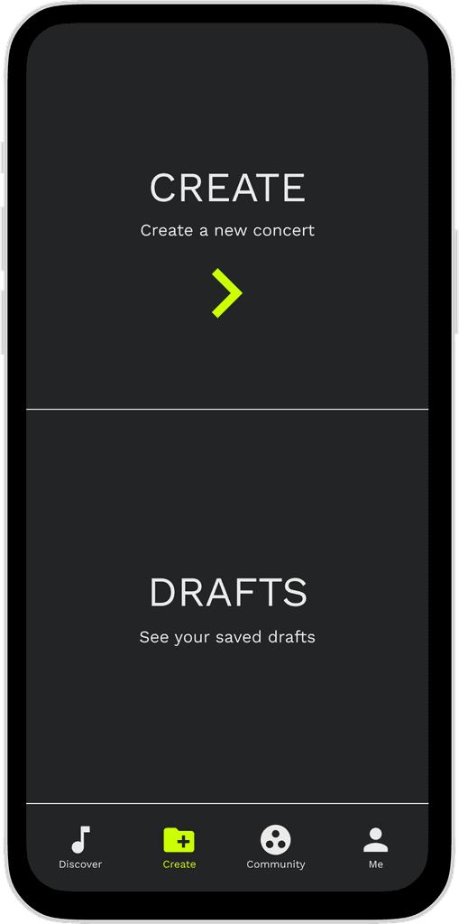
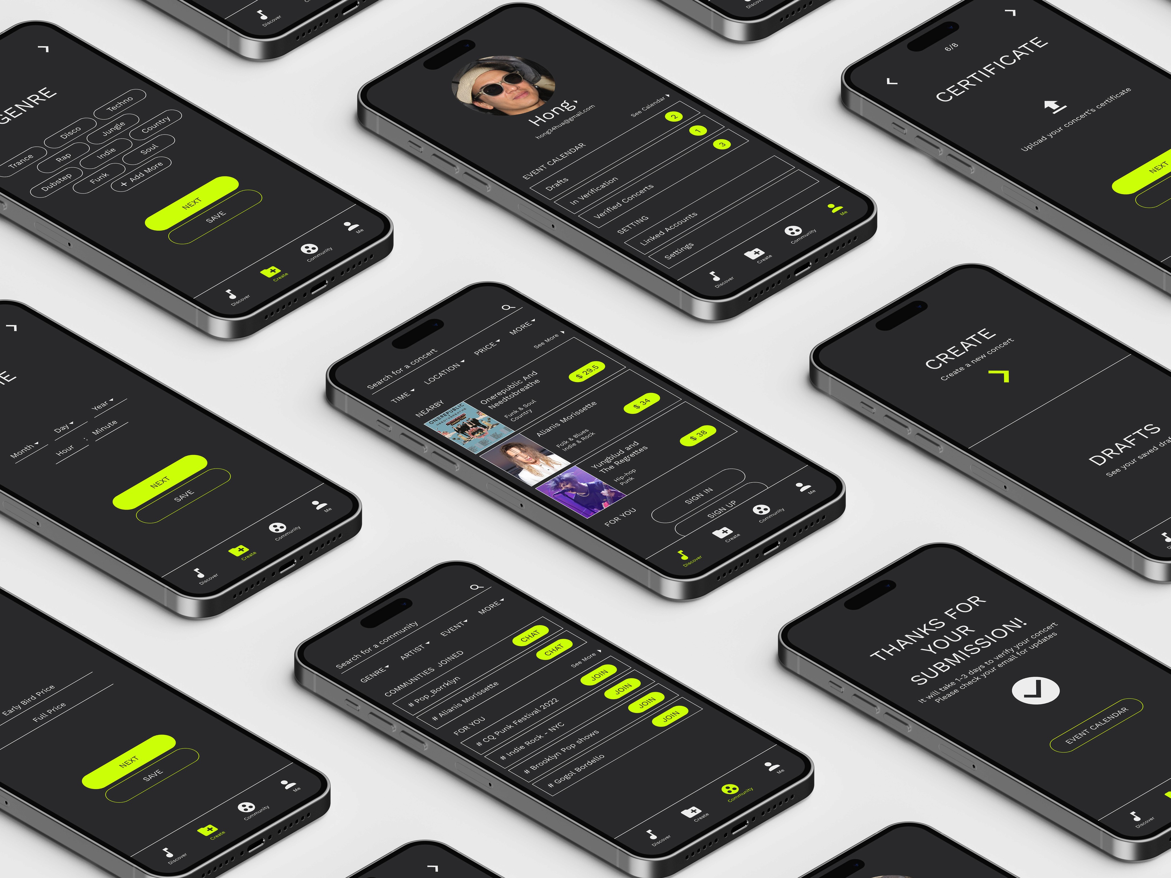
Munit is a concerts and live shows recommendation app that helps live show lovers find more affordable concerts during Covid. Additionally, Munit provides an easy-to-use platform for young musicians to create and promote their own shows. By bringing them together, Munit wants to foster a community for live music lovers.
Prototype
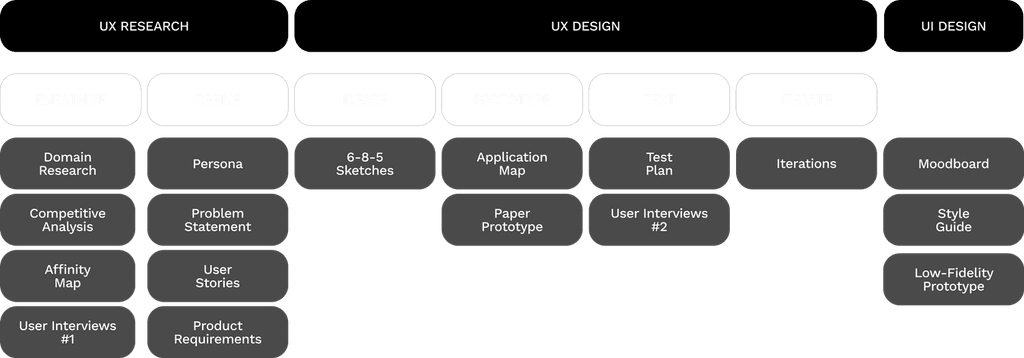
PROCESS
DOMAIN RESEARCH
In 2022, the industry of live shows and concerts was largely impacted by pandemics worldwide. However, we see that the popularity of virtual concerts and live streaming increased as the result. The online live-streaming industry has grown 99% between April 2019 and April 2020, and the live-streaming industry is expected to be valued at 184.27 billion USD by 2027. (Tech Jury, 2020).
We want to tap a relatively unsaturated market and build our app around streaming music concerts and music-related experiences online in addition to the services most other events-based platforms offer.
COMPETITIVE ANALYSIS
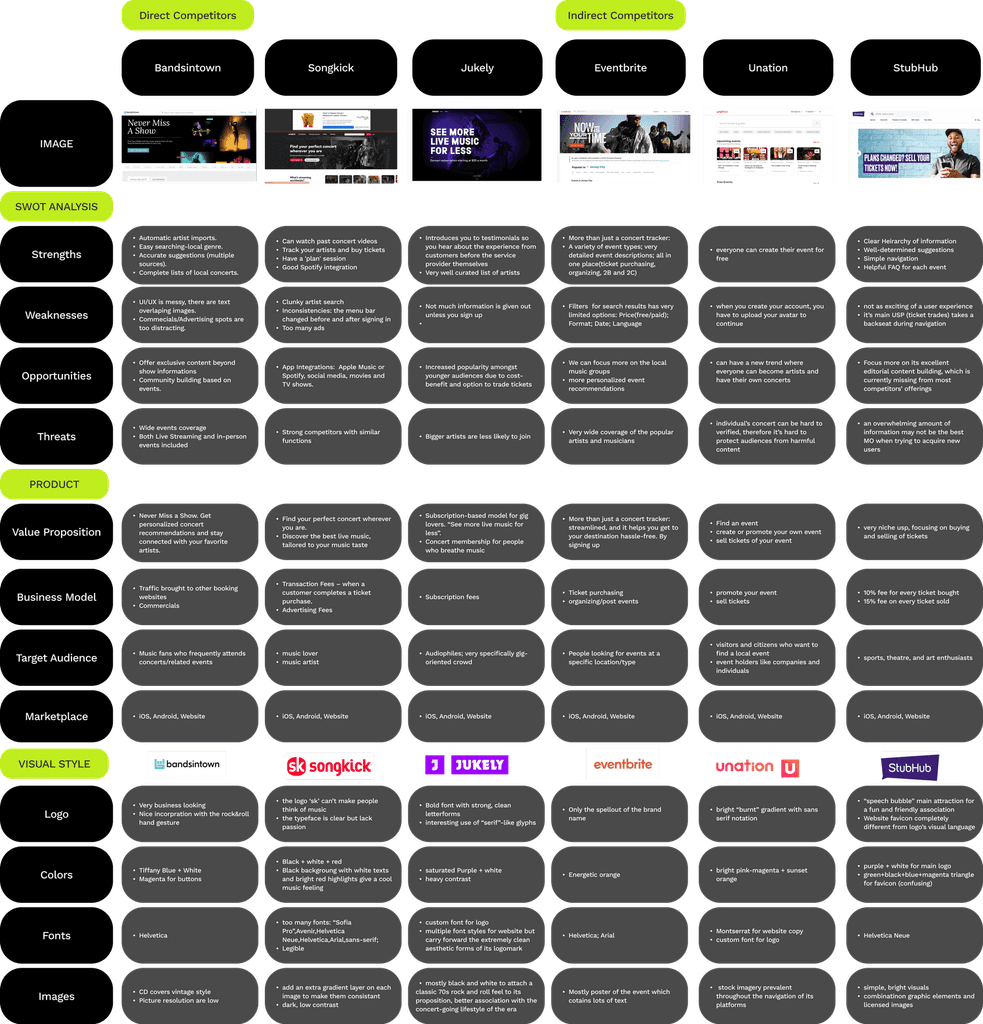
In order to find out what’s going on in this market, we chose three direct competitors who are focusing on concerts and live music recommendations: Bandsintown, Songkick, and Jukely. Besides, we also chose three indirect competitors that are events-based platforms: Eventbrite, Unation, and StubHub.
In SWOT Analysis, we identified each platform’s strengths, weaknesses, opportunities, and threats. In product analysis, we focused on their value proposition, business model, target audience, and marketplace. Finally, in visual style analysis, we explored their brandings like logo design, color matching, font family, and image choices.
AFFINITY MAP
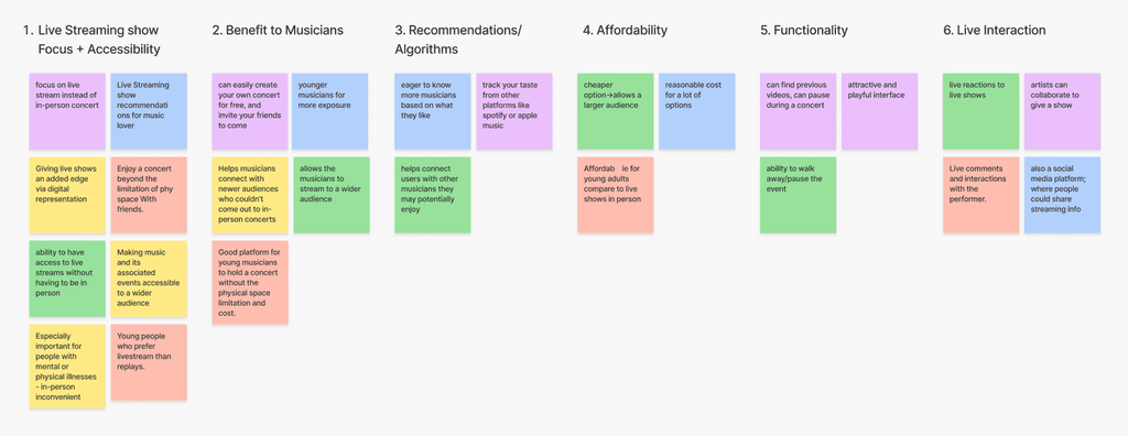
After competitive analysis, we mapped our research insights to an affinity map, which helped us to discover embedded patterns. We sorted and clustered our insights into 6 directions.
1. Live Streaming show Focus
2. Benefit to Young Musicians
3. Recommendations/Algorithms
4. Affordability
5. Functionality
6. Live Interaction
USER INTERVIEWS
#1
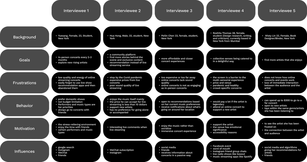
We chose 5 concert lovers to interview, with the purpose of finding out their goals, frustrations, behaviors, and motivations when searching and going to a concert.
KEY FINDINGS & INSIGHTS
Key Findings
Insights
Goals
100% of interviewees are dissatisfied with online streaming and want to return to more affordable and closer in-person concerts.
Shift the lean on online streaming to in-person shows recommendation.
Motivation
80% prioritize the artist as the most important aspect of listening to music; 20% also talked about the multisensorial experience: they want not just music but also lights, posters, food, stage, etc.
Prioritize the function of searching for performers and music genres.
Behavior
80% showed interest in exploring other artists and supporting new rising artists.
Handover the reins to the young artists by letting them share their own events, so the app remains decentralized and aids local performers.
Frustrations
80% said online streaming has low quality and is not engaging because it can be pre-recorded; all of the platforms were not engaging users in dialog about the events they attended.
Build and maintain an engaging music lovers’ community where they can share feedback and stories behind the events.
PERSONA
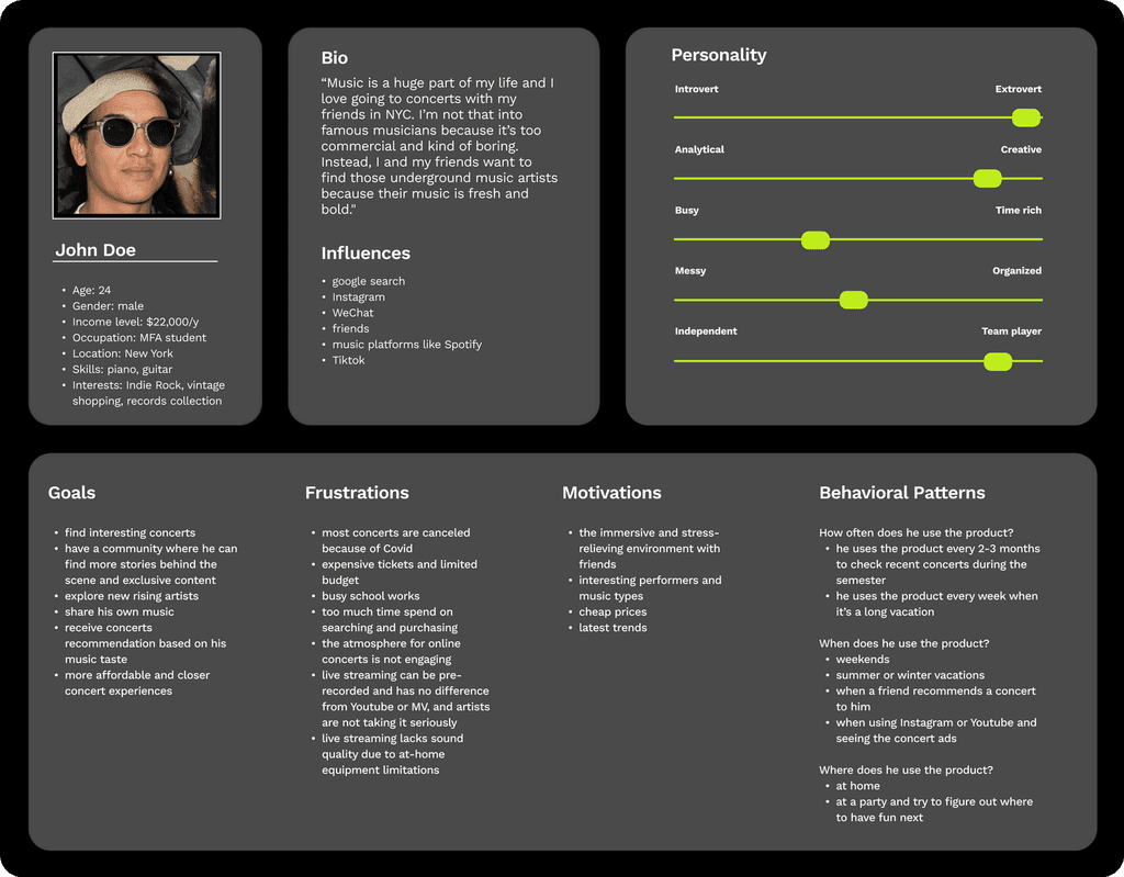
After sorting out the key findings and insights from the user interviews, we created this user persona based on the demographics of our interviewees and their goals, frustrations, and motivations.
PROBLEM STATEMENT & PRODUCT REQUIREMENTS
Based on our persona, we created a clear description of the issue that we identified from our research faced by our users:
John, a young adult who just started his career is looking for a more affordable way to access local music, live shows, and communities because of their common need for live interactions with people who have similar interests locally.
Product Goals
︎ [Discover]: Recommend affordable in-person live shows based on performers and music genres.
︎ [Create]: Help non-mainstream musicians and young artists by letting them share their own events in an easy way.
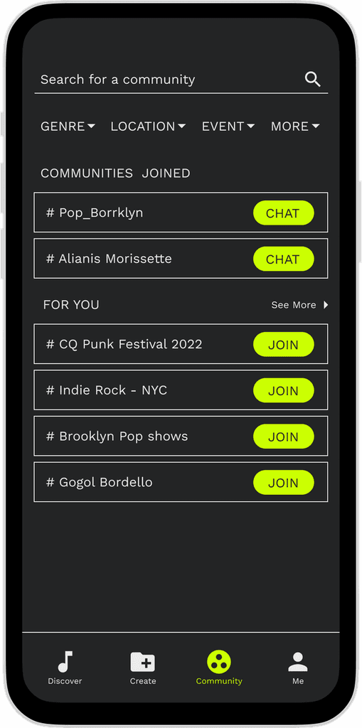
︎ [Community]: Build and maintain an engaging music lovers’ community through shared interests.
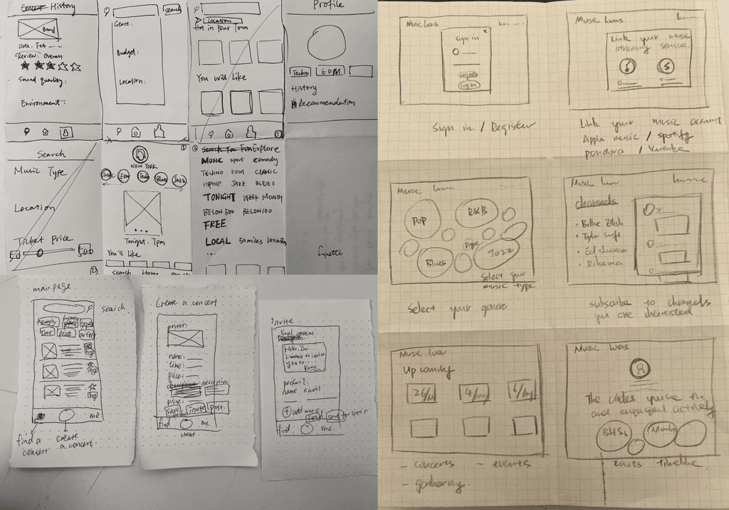
6-8-5 SKETCHES
This is a quick ideation and brainstorming method that focuses on quantity over quality. We drew 6 to 8 sketches in total, with 5 minutes on each panel. The panels demonstrate the entire user flow of our product.
APPLICATION MAP
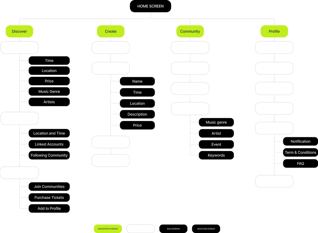
Based on our product requirements, we created this application map to show the structure of our product. It has four sections: Discover, Create, Community and Profile.
PAPER PROTOTYPE
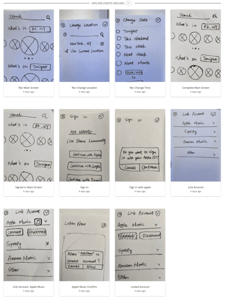
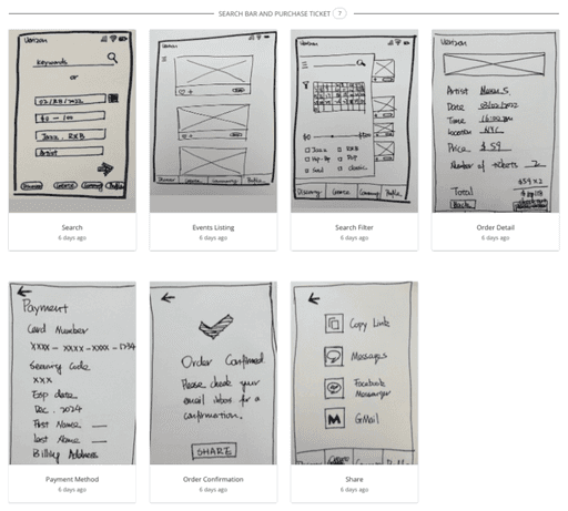
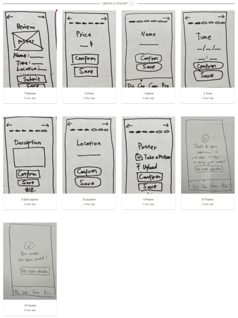
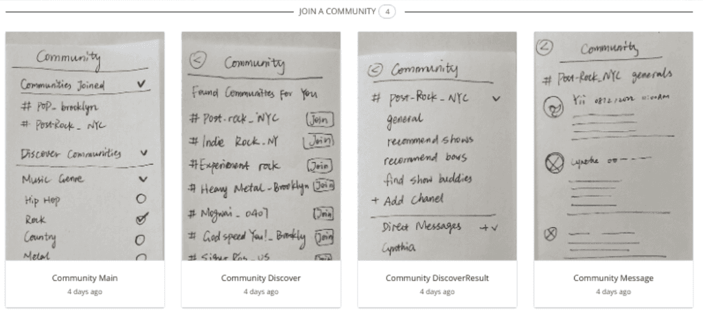
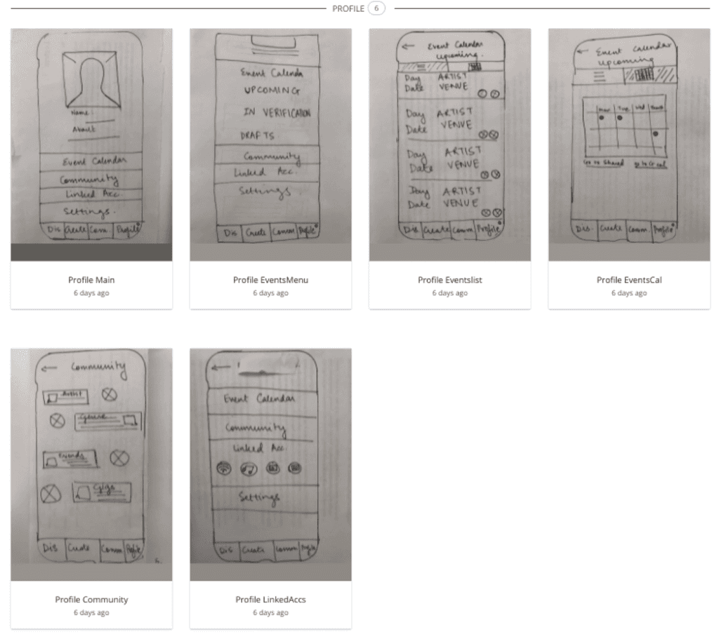
We drew our paper prototype based on 5 key user flows in our product.
1.Explore events around
2.Search for a show and purchase tickets
3.Create a concert
4.Join a community
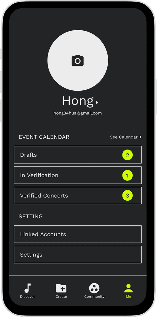
5.View my profile
TEST PLAN
Test Objectives
To determine design inconsistencies and usability problem areas within the user interface and content areas, and to identify potential design concerns to be addressed in order to improve efficiency, productivity, and end-user satisfaction.
Methodology
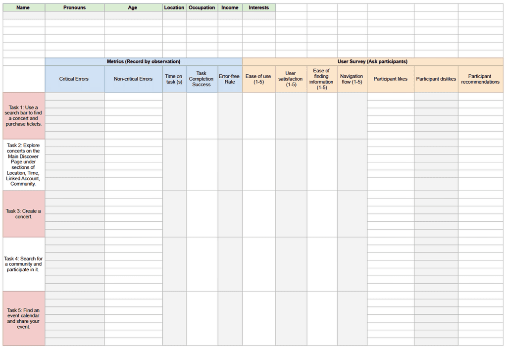
This user testing will collect data from 10 participants. The testing will be conducted in a quiet space with an internet connection. Participants will be given a mobile phone to complete the task list given. Participants’ demographic information will be collected, as well as suggestions for improvements. Data Logger will be collecting specific metrics for future developments and iterations.
Usability Tasks
Task 1 - Use a search bar to find a concert and purchase tickets.
Task 2 - Explore concerts on the Main Discover Page under sections of Location, Time, Linked Account, Community.
Task 3 - Create a concert.
Task 4 - Search for a community and participate in it.
Task 5 - Check information in the user profile.
Usability Metrics
1. Successful task completion
2. Critical errors
3. Non-critical errors
4. Error-free rate
5. Time on task
6. Subjective measures
7. Like, dislikes and recommendations
Template
USER INTERVIEWS
#2
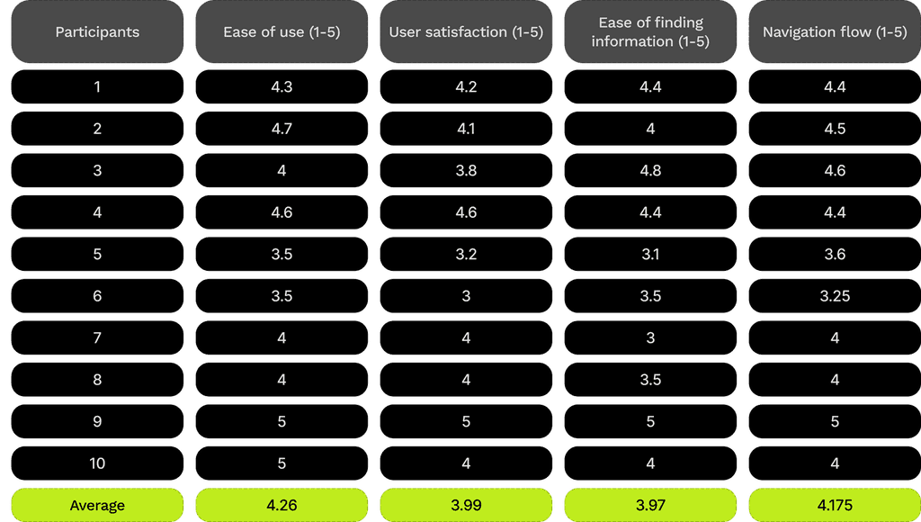
We did the user tests with 10 participants who were new to our product. We filled out the usability metrics as follows and calculated the scores on user experience.
Usability Metrics
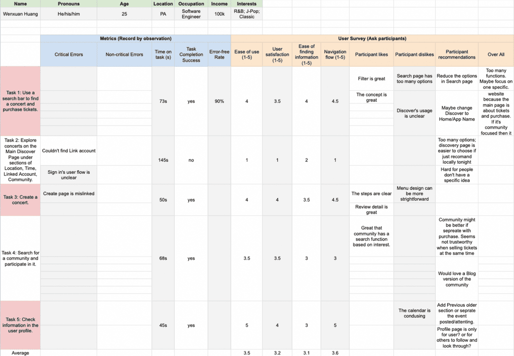
Scores
ITERATIONS
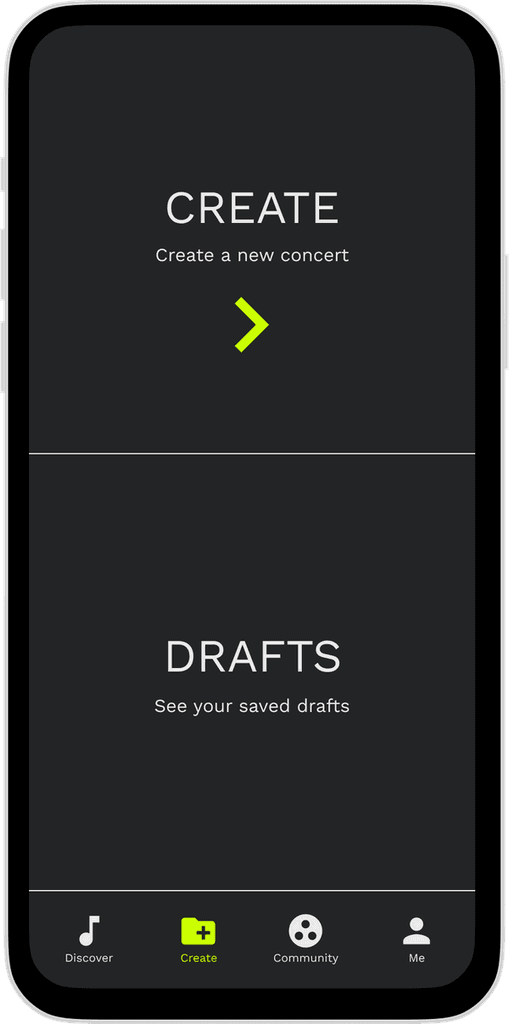
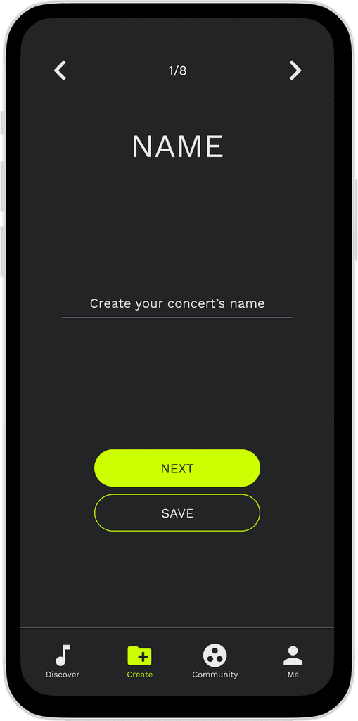
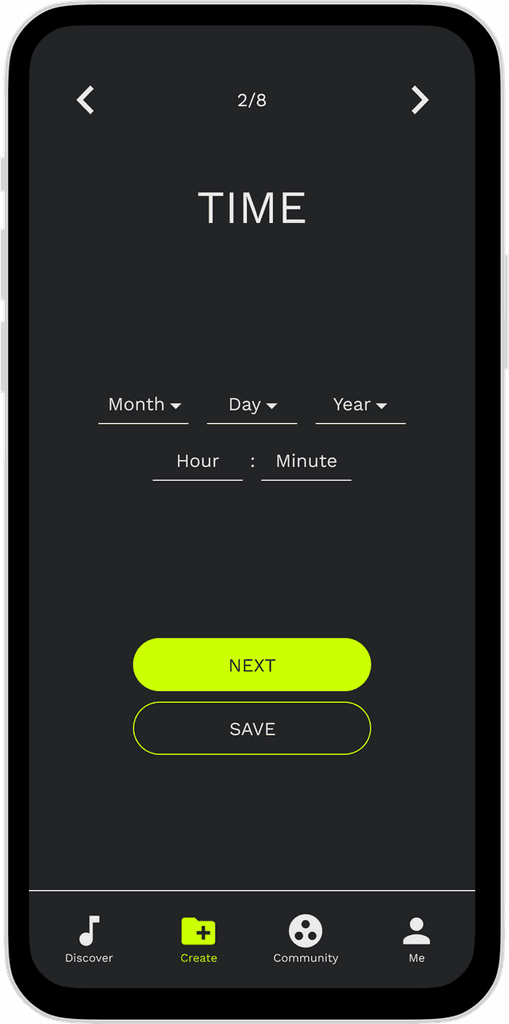
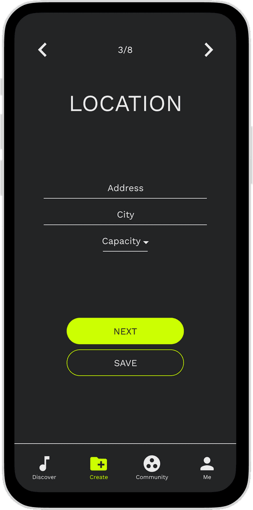
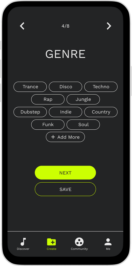
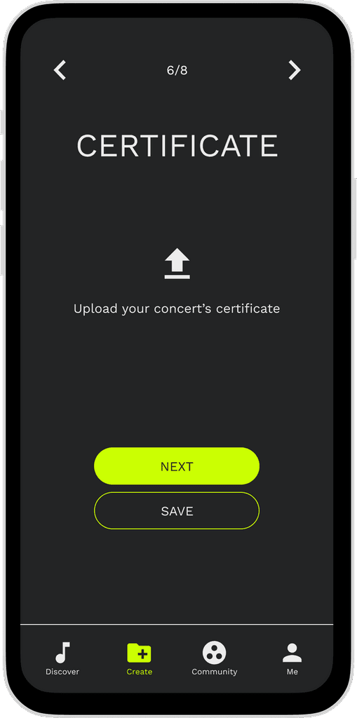
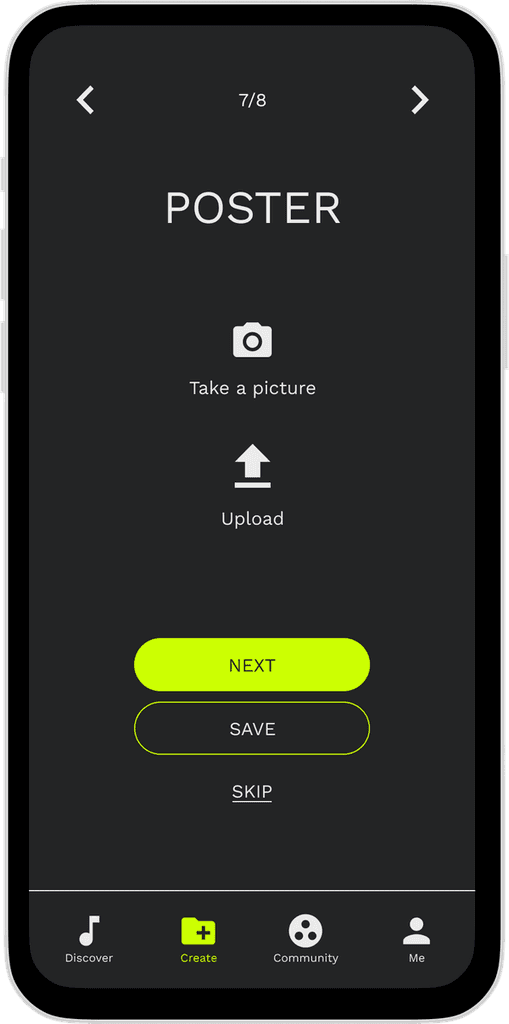
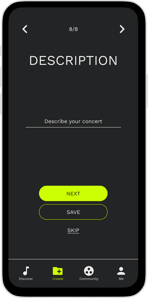
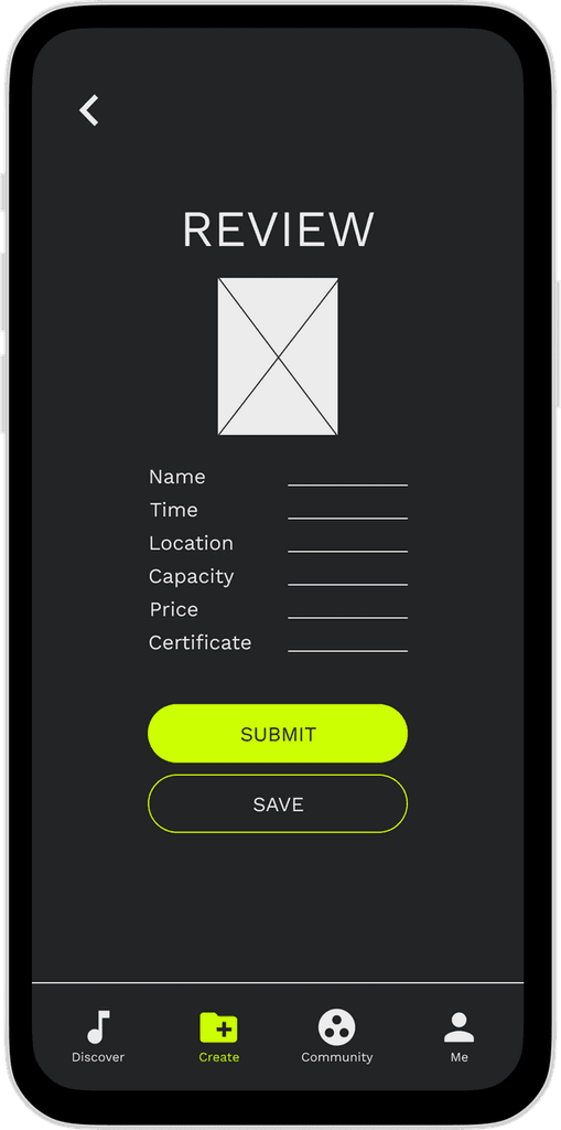
I mainly focused on the feedback and iteration of the “Create a concert” user flow since this part is my responsibility. All the interviewees loved the create-their-own-concert feature and they provided invaluable feedback for me. Based on the feedback, I iterate the “Create a concert” function into the next step.
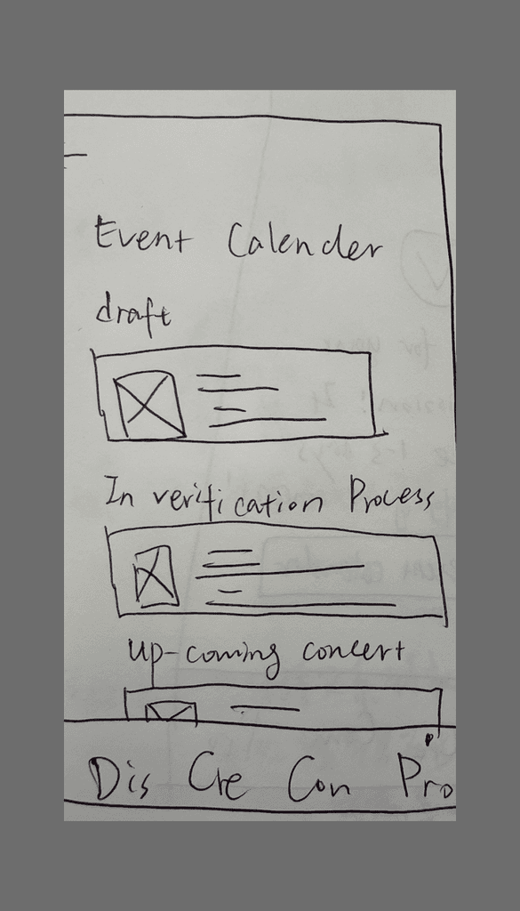
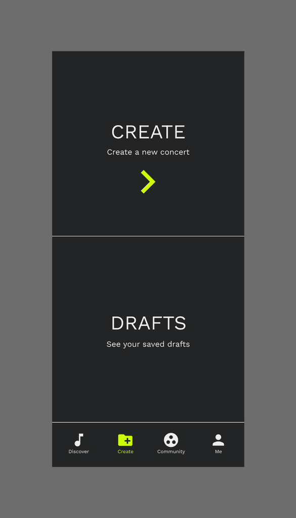
1.Where to find the saved draft?
Before
The saved draft can only be found in “My Profile”
After
Can also access draft under “Create”
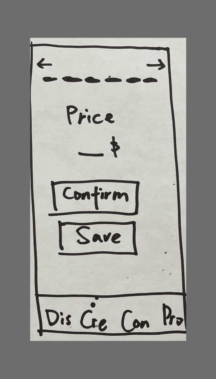
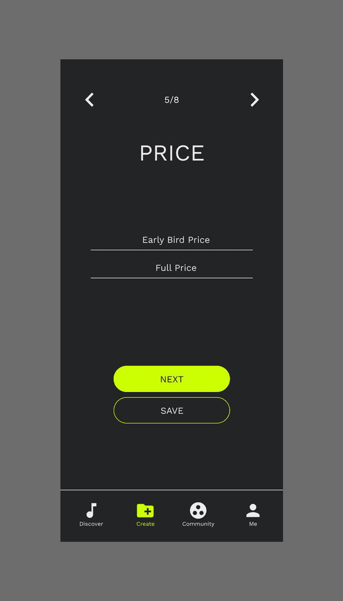
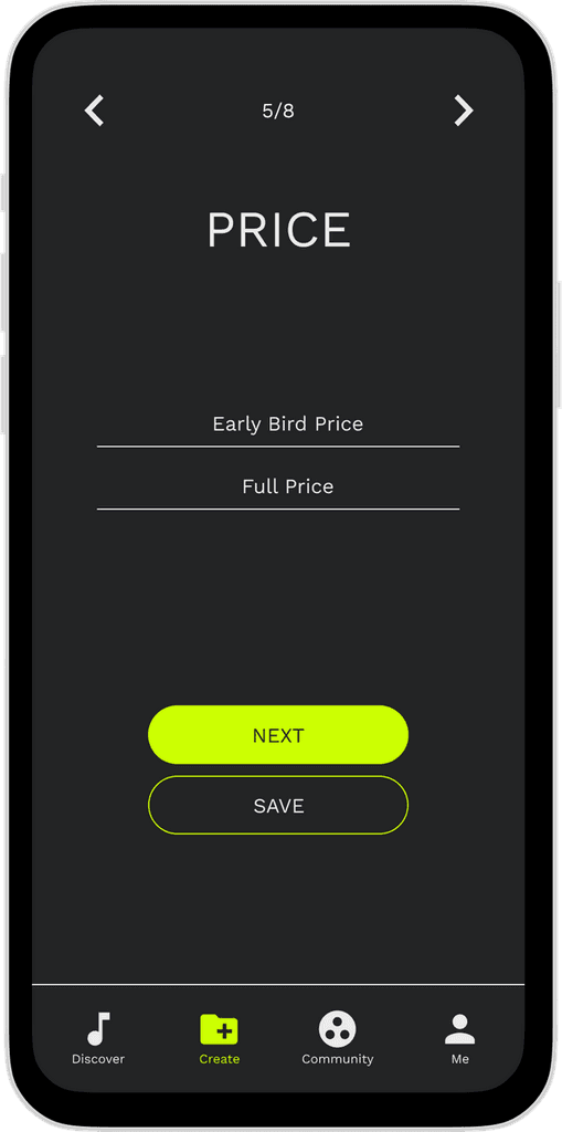
2. How to set up the price?
Before
Only a certain price is listed
After
Differentiate from Early Bird Price to Full Price
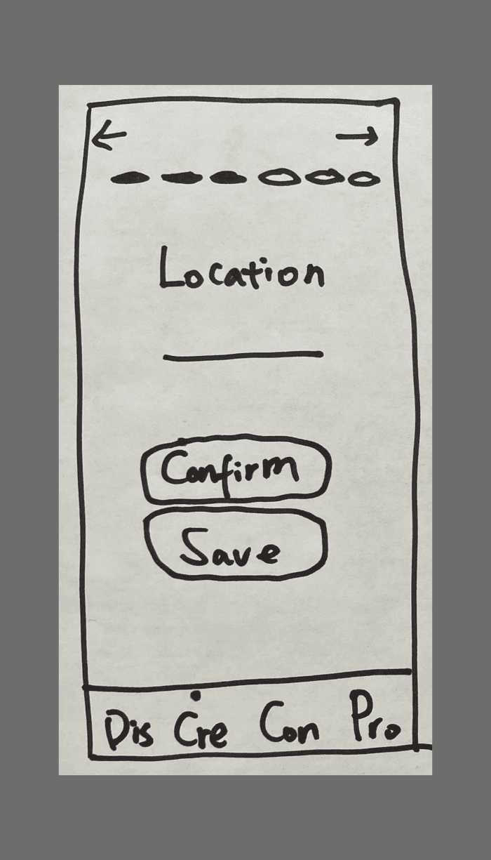
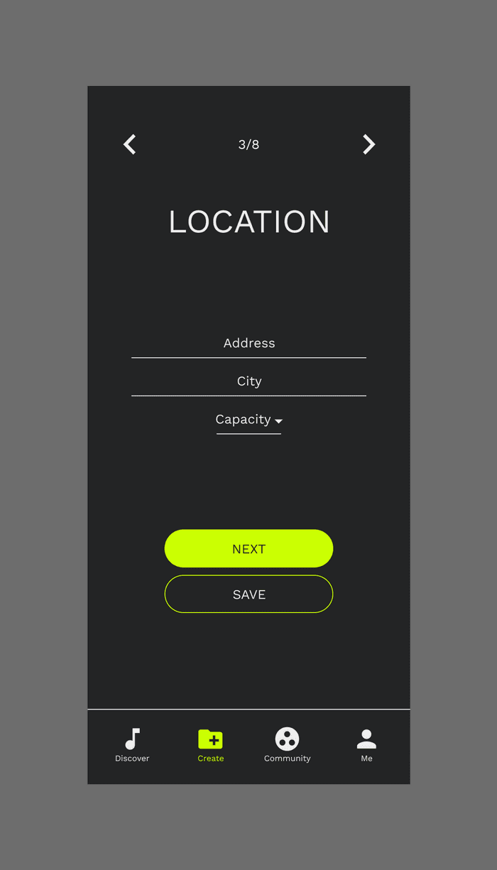
3.Where to publish the capacity information?
Before
No capacity is listed
After
Add the capacity under “Location”
MOODBOARD
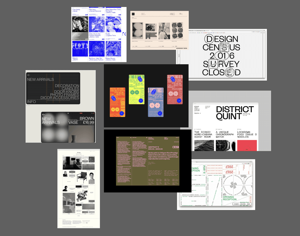
I found these references for my moodboard. Since this product will face live show lovers and young musicians who are mostly very young and cool, so I believe we can make it look modern, artistic, clean, and concise.
STYLE GUIDE
In order to keep it clean and concise, I only used 3 colors in this product: the primary color black, the secondary color bright green, and the third grey white color for texts and icons. The contrast between the black and green, black and white both passed the WCAG AAA standards, which means their contrasts are high enough for visually impaired users. The contrast between white and green didn’t pass, so I avoided using these two colors together.
I used a grid layout of 4 flexible columns, with 2 side margins of 16px on each, and 3 gutters of 16px on each. For the typography, I chose the Work Sans and they are used in 40px, 36px, 16px, and 12px. For the iconography, I used the Material Design system to find suitable icons.

LOW-FIDELITY PROTOTYPE
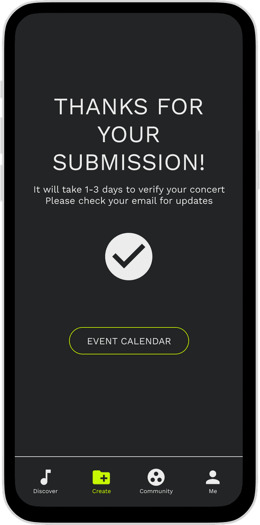
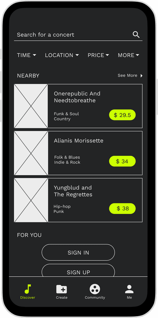
LOW-FIDELITY Pages
HIGH-FIDELITY PROTOTYPE

FUTURE IMPROVEMENTS
Adjust the main focus on Home page. Currently is more purchasing-focused instead of Community and Creating concerts since the home page is directly leading to purchase.
Enhance the connection between Events and Community.
Better organization of the Community section in terms of search, join, announcements and categorization.
